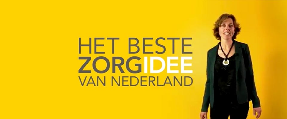
Nominated as a finalist in the “best care idea in the Netherlands” in 2014, the Red Flags (Rode Vlaggen) Instrument came out of a collaboration between FLO interactive, software entrepreneurs Code Yellow, Health Base, and Hogeschool Utrecht.
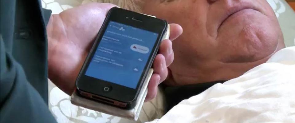
We designed and prototyped a simple app intended for home care workers looking for a way to register and communicate the incidents that occur in the lives of their patients.
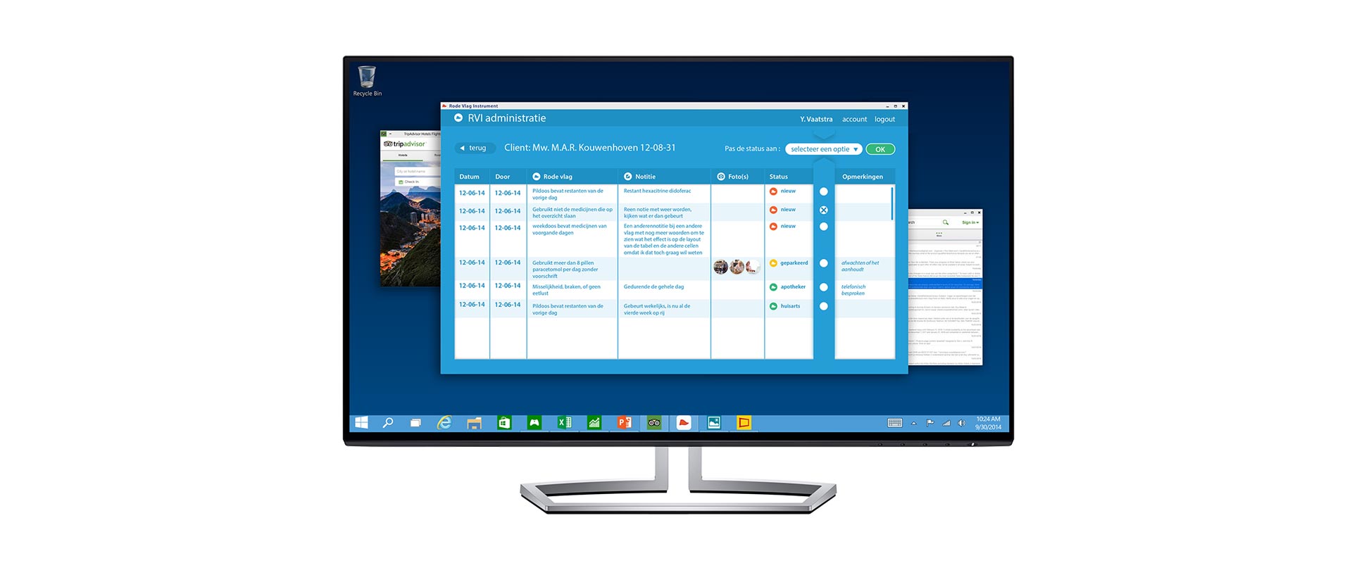
Extended to include a treatment assessment tool for the care coordinator, the system has been a success, and is being deployed in various regions of the Netherlands.


Context
Home Care workers are busy people and in some cases have special literacy needs. Until now they have had no effective means to register the issues that their patients present.
The Rode Vlaggen Instrument utilizes a methodology developed by the Hogeschool Utrecht to observe risky situations in a timely manner, and thus prevent hospitalisation We translated this to a simple and intuitive reporting system that directly feeds back to the pharmacist or family doctor.
Piloted and discussed extensively with the user base we were able to refine the design based on contextual use and experience.

Impact
Intuitive, efficient ... well we thought so, and the jury thought so too, as the app was voted into the final 6 of a national competition. We didn’t win, but were thrilled to see the enthusiasm for the app as a result.
Taken up by increasingly more regions in the Netherlands, it is clear that the market for simple connected devices of this kind is growing.


“... life and health of our clients has been measurably improved by the app, as it is easier and more efficient ...”
Judith van Leeuwen
WIJKVERPLEEGKUNDIGE SCHAGEN

Project Team


Information design
UI concept
Visual design

A lesson that seemingly insignificant elements of workflow can benefit from design thinking.
We would love to hear about your project, let's have a cup of coffee and connect.